
These days, businesses have no choice but to create visually appealing graphics to promote their brand. For some businesses that are smaller and don’t always have the time or budget to have a graphic designer on hand, it is easy to fall into a pattern where the graphics that you do create fall short of giving the appearance of professionalism and the ability to adapt to modern business practices. That’s why we have put together five simple rules that can help your small business or organization create graphics that will get the attention of your target audience. People are typically wired to respond to visuals better, and studies have shown that more people interact with infographics and images than they do with regular posts (Guerrero, 2022). So let’s dive in and take a look at the rules. We’ll be providing some great free resources for you to use throughout.
Use a consistent style of images and know where to find them.
As we already mentioned, creating visuals is important, and that’s because of how most people process information, even when it comes to reading text. So when you’re thinking about using photos and illustrations for your brand, make sure it’s relevant to the message you’re trying to promote. Learning proper techniques for editing photography can be much easier than most people think, and every brand of smartphone has tools to change things like brightness, saturation, and exposure. If these are terms that you’re not up to speed with, check out this video that breaks it down. And if you need stock footage and illustrations to use for your graphics, check out Pexels and Freepik for some great cheap and, a lot of times, free, high-quality images to use.
Use Consistent Branding, Including Your Logo and Colors.

We all know that having the right logo and colors associated with your brand helps people identify you. In our area, you might see the same logos in advertisements and social media posts or displayed as sponsors for various community events. It’s imperative that your logo makes sense and that you possess a good-quality version for whatever you need it for. Take the example that you see here for the Wisconsin Economic Development (WEDC) Cyber Matters workshop post that we shared on our social media recently.
The logos for all the presenting sponsors are relatively the same size, the information is clear and easy to read, and the colors of the text are consistent with WEDC’s branding and logo. If you need help redesigning and cleaning up your logo, contact us at OED. We’re happy to get the resources you need.
Keep Your Fonts Simple.
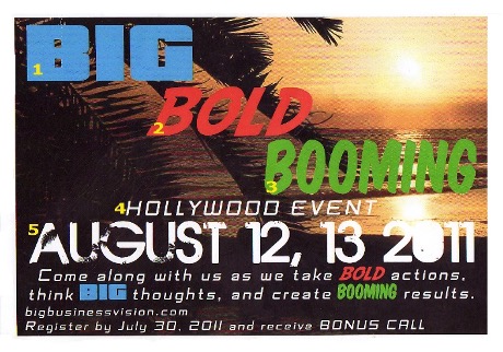
Speaking of text, we always want to make sure you are keeping your number of different fonts to no more than two or three (Babich, 2017). Using more than three different fonts makes a graphic and a website look unstructured and unprofessional.
If your logo uses text, try to stick with that text when you create graphics, whether they are for your social media, letters that you send to customers, or posters and advertisements that you create. Having a general understanding of Typography and how it helps create an interesting design is highly recommended.
Take Time to Learn the Rules of Graphic Design.
You may think that it takes too much time, effort, and money to learn graphic design, and if you feel that way, it’s almost certain that it may be too difficult for you to hire someone that you trust to make your business or organization look good. But there are so many great free workshops and resources that help to teach you the essentials of graphic design. If you’re looking to invest in industry-standard programs, some of our favorites to use are the Abobe creative platform and the Affinity Suite of programs. Both of these companies make great tools that you can use on almost any type of device, and we’ll link some great resources to help you get started at the bottom of this post. And as we’ve already stated, if you need someone more local to help, again, reach out to us here at OED.
Make Sure Your Post Matches the platform.
There’s a common misconception that I can just create a graphic and copy and paste it everywhere else, and that’ll be good enough. But that couldn’t be farther from the truth. While you may end up using a lot of the same elements of a graphic when you create a printed poster and a social media post, you may want to consider adapting it for each medium that you use. And it can’t be stated enough to try and create graphics that you know will look good on a mobile device. Keep in mind that QR codes are best suited for printed ads and flyers and shouldn’t be in anything you’re going to share electronically. If you’re utilizing Instagram as a platform, don’t overcrowd your image with lots of text like you can with Facebook or in your email campaigns. Utilizing a tool like Canva can really help you with finding the right tone and give you ideas on how to make your brand pop.
In summation, be mindful of how people will be looking at your graphics. Don’t be afraid to experiment; start off simple, and like anything that we do in life, it takes practice and dedication to master it. If you are in need of any help with marketing your business, OED has the resources you need.

HELPFUL LINKS:
Freepik (Find and download the best high-quality photos, designs, and mockups)
Canva (Canva makes it easy to create professional designs and to share or print them)
Yes I’m a Designer (Adobe Certified Instructors)
Affinity by Serif (Professional Creative Software)
Pexels (Free Stock Photos, Royalty Free Stock Images & Copyright Free Pictures)